
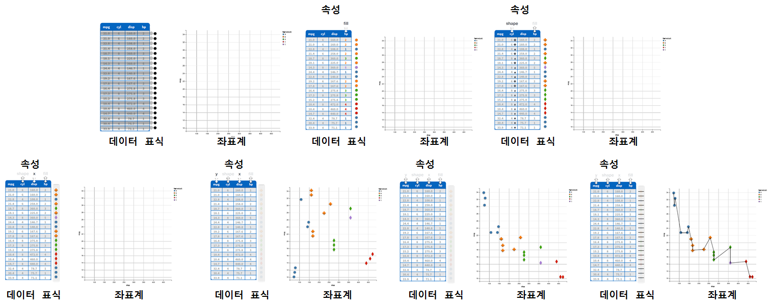
데이터 과학 - 시각화
1. ggvis 개요
ggvis는 R의 강력한 데이터 분석엔진을 HTML5와 자바스크립트를 결합하여 인터랙티브 상호작용과 화면출력을 접목하고자 Winston Chang이 주도되어 개발되었다. 물론 그래픽 문법(Grammer of Graphics)과 ggplot2에 기반하고 있다.
데이터 캠프(datacamp) Data Visualization in R with ggvis 과정에 그래픽 문법 개념을 잘 설명하고 있다.
2. ggvis 예제
2.1. ggvis 산점도와 평활선
library(ggvis) 명령어로 ggvis 라이브러리를 불러온다. 파이프 연산자를 사용해서 mtcars 데이터셋을 ggvis 함수에 넣어 차량무계(wt)와 연비(mpg)를 데카르트 좌표계에 넣고, layer_points() 함수로 점을 찍고, layer_smooths() 함수로 평활선을 추가한다.
library(ggvis)
mtcars %>% ggvis(~wt, ~mpg) %>%
           layer_points() %>%
layer_smooths()2.2. ggvis 선그림
ggvis 라이브러리로 선그림도 가능하다. 동일한 mtcars 데이터셋과 동일한 데카르트 좌표계를 사용해서 ggvis 함수에 넣어 차량무계(wt)와 연비(mpg)를 넣고, layer_lines() 함수에 색상, 선폭, 선모양을 차별화해서 시각화한다.
mtcars %>% ggvis(~wt, ~mpg) %>%
           layer_lines(stroke:="red", strokeWidth:=2, strokeDash:=6) %>%
layer_smooths()2.3. ggvis 히스토그램, 밀도 그래프, 막대 그래프
ggvis 라이브러리로 물론 히스토그램과 밀도(denstiy) 그래프도 가능하다. 동일한 mtcars 데이터셋과 동일한 데카르트 좌표계를 사용해서 ggvis 함수에 넣어 연비(mpg)만 넣고, layer_histograms() 함수에 width=7을 인자로 넣어 히스토그램을 완성한다.
mtcars %>% ggvis(~mpg) %>%
layer_histograms(width=7)layer_densities() 함수에 fill:="orange"로 색상 인자로 넘겨 밀도 그래프를 완성한다.
mtcars %>% ggvis(~mpg) %>%
layer_densities(fill:="orange")layer_bars() 함수에 fill:="orange"로 색상 인자로 넘겨 막대 그래프를 완성한다.
mtcars %>% ggvis(~factor(cyl)) %>%
layer_bars(fill:="orange")3. 인터랙티브 상호작용 시각화
ggvis에서는 다음 7가지 인터랙티브 상호작용 위젯을 지원한다.
input_checkbox()input_checkboxgroup()input_numeric()input_radiobuttons()input_select()input_slider()input_text()
input_radiobuttons 라디오버튼을 사용해서 색상을 인터랙티브하게 변경할 수 있다.
mtcars %>%
  ggvis(~mpg, ~wt,
        fill := input_radiobuttons(label="Choose color:",
                             choices=c("black", "red", "blue", "green"))) %>%
layer_points()데이터프레임 변수에서 직접 값을 추출해서 input_select 선택값으로 선택하는 것도 가능하다.
mtcars %>%
  ggvis(~mpg, ~wt, fill = input_select(label="Choose fill variable:",
                                      choices=names(mtcars), map=as.name)) %>%
layer_points()4. ggvis 범례와 축서식
add_legend() 함수를 통해 범례를 추가하고, add_axis() 함수를 통해 축서식을 설정한다.
mtcars %>%
  ggvis(~mpg, ~wt, opacity := 0.6,
        fill = ~factor(cyl))  %>%
  layer_points() %>%
  add_legend(c("fill"), title="실린더 유형") %>%
  add_axis("x", title = "Weight(차체 중량)")  %>%
add_axis("y", title = "연비(mpg)")5. ggvis 척도(scale)
ggvis 척도를 다음 함수 5개를 사용해서 설정한다.
scale_datetime()scale_logical()scale_nominal()scale_numeric()scale_singular()
mtcars %>%
  ggvis(~wt, ~mpg, fill = ~disp, stroke = ~disp, strokeWidth := 2) %>%
  layer_points() %>%
  scale_numeric("fill", range = c("red", "yellow"))